


Color proofing the images of my new book at Phaidon's office in Soho
More fun that people should be allowed to have.

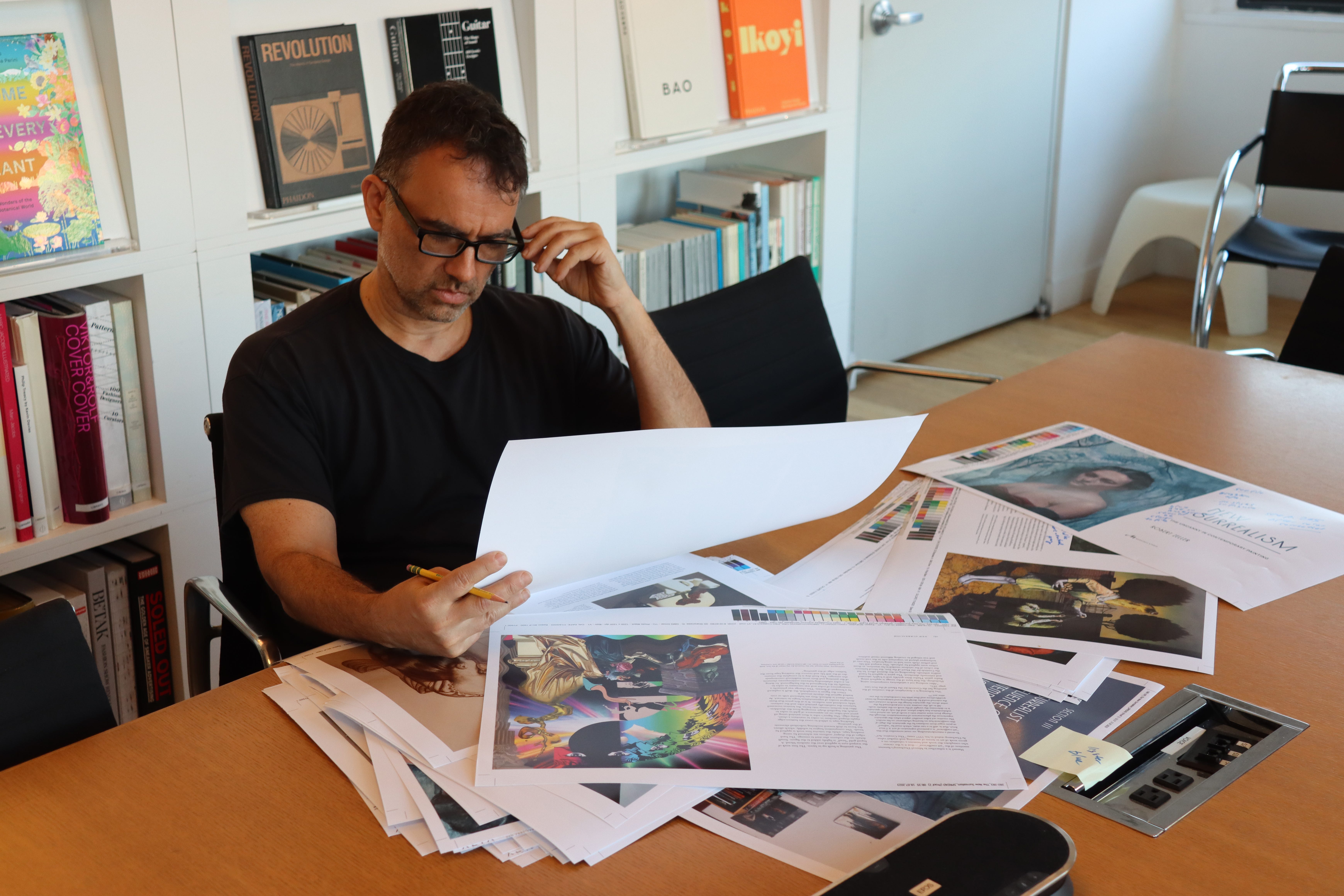
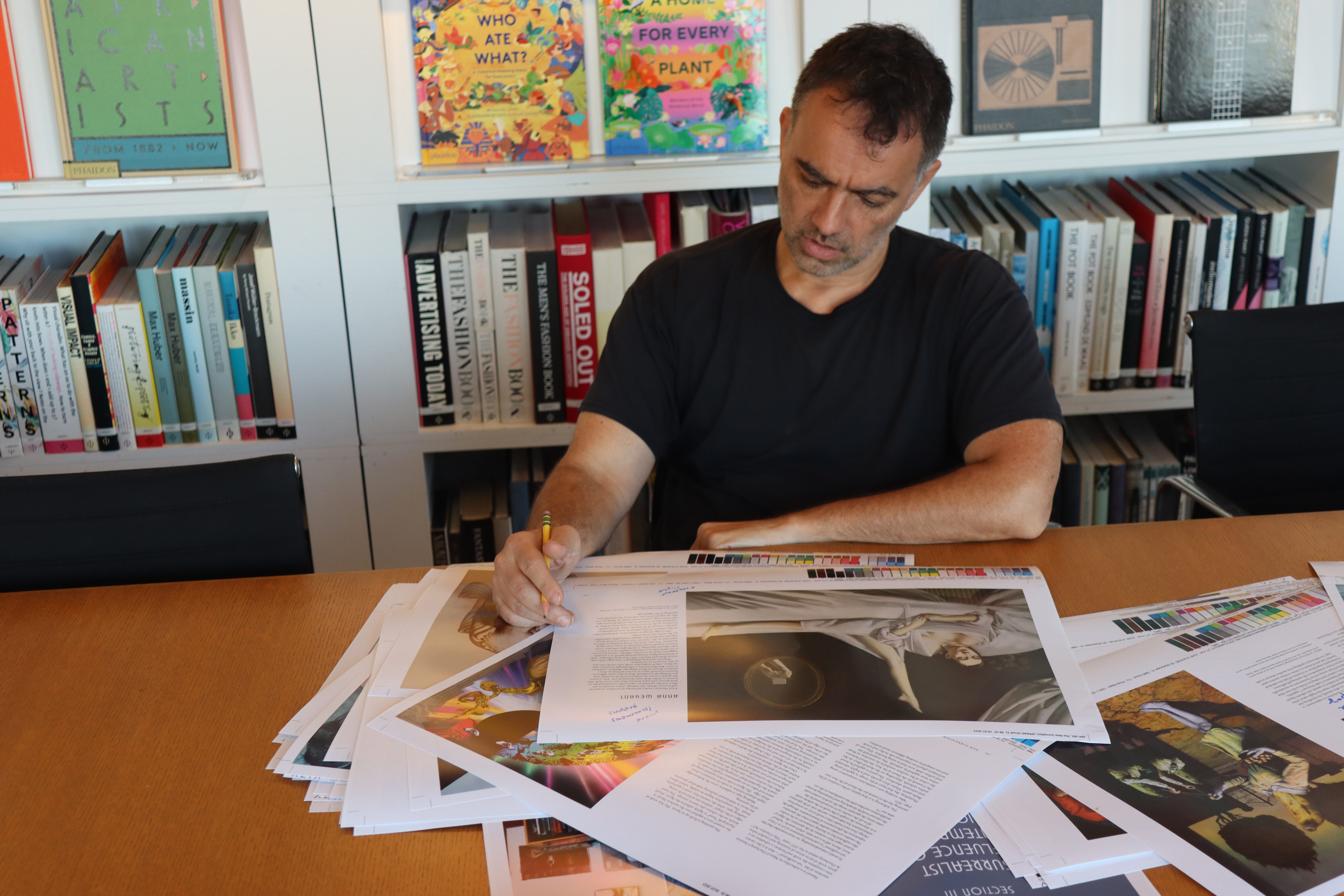
Me, fastidiously working in Phaidon’s office on Bleeker St in Soho.
This month my new book, New Surrealism, the Uncanny in Contemporary Painting, reached the stage of color proofing. This is when the author and the production editor sit down together and go through every page book, every image of the book, one by one, and mark down the necessary corrections for the printer to adjust before the book can go to press. It is a painstaking process, especially in a book like this one, weighing in at 336 pages, with nearly 400 images within. Luckily, it was just he and I making the final decisions. Sometimes others are involved. Then it takes a really long time to get through it.
When you are color proofing images for print, you have to accept that the printed image will never look like a computer screen version of that same image. The transition from a backlit RGB monitor to a CMYK semi gloss print is never a one-to-one, defacto conversion. With New Surrealism, I had images sent to me and my team by artists all over the world. In each cases, I only had digital files to reference against the printed version. No one sent me physical paintings to look at. Some artists included the color card in with the shot of the painting( old school, and always a good move for accuracy’s sake), but most did not. It’s a step that seems to be going out of style.
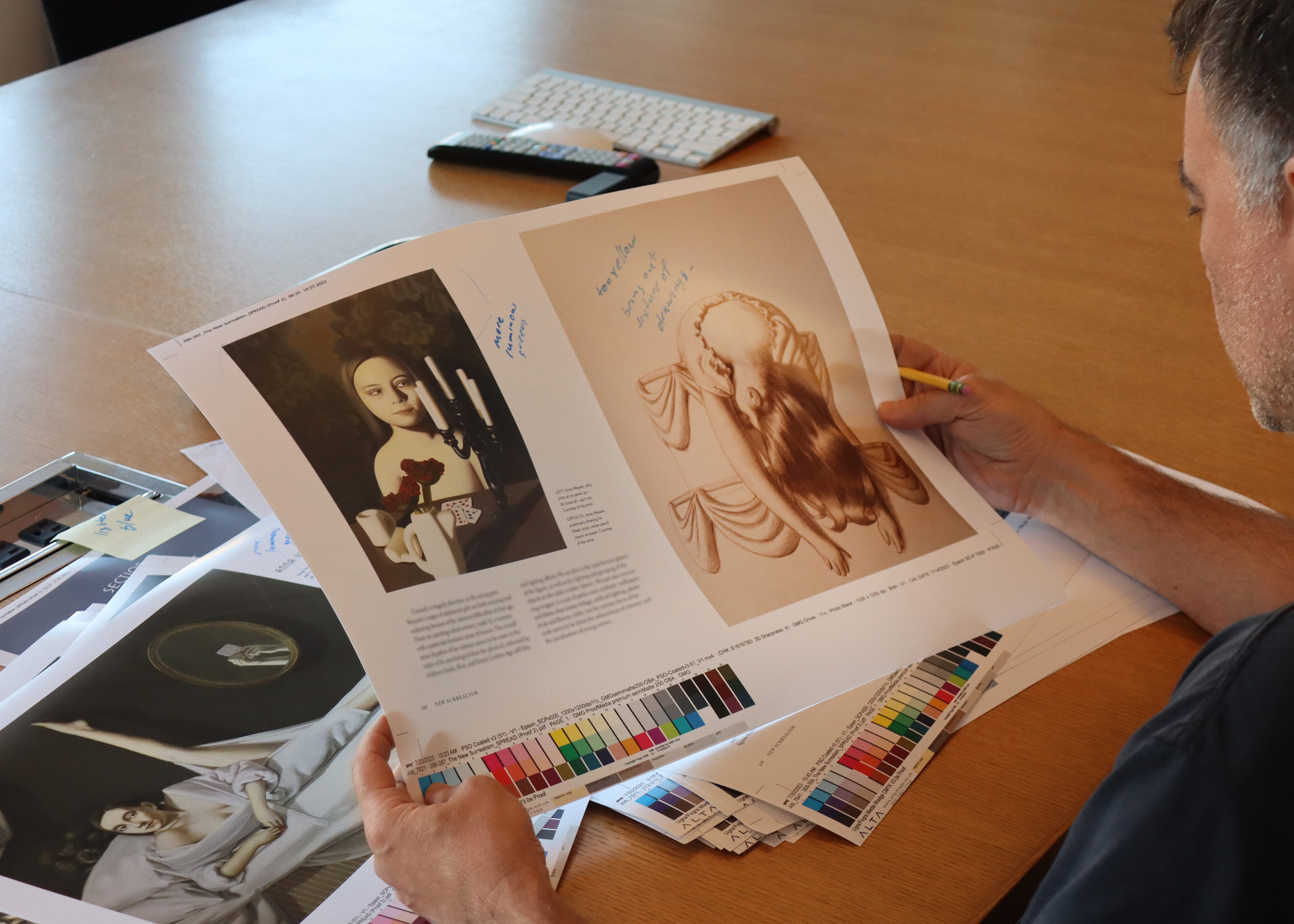
Reviewing a spread from the artist Anna Weyant, from her section in the book.
Michael and I started in the middle of the day, when the natural light in Phaidon’s Soho offices was the strongest. Natural light provides the best range to see accurate color. In the morning and near dusk, the light from the sun shifts yellow, which can affect the way we perceive color. Any artist who relies on natural light knows this, but it is also applicable to this aspect of publishing.
Michael is a patient man. Fastidious. I would tell him what I thought of a given reproduction. Then he would write out my comment, translating it into a shorthand that he and the onsite photo proofer at their repro house in Midtown understands and can execute.
Production Editor Michael Vagnetti working out the color proofing the image opposite the title page.
The conversation ran something along these lines, image by image:
RZ: This one needs more contrast
MV: Yeah, I see it.RZ: Too muted. All over.
MV scribbles a note next to the image.
RZ: This one has too much magenta.
MV: Where?
I point to the offending areas. MV circles the areas with a marker and then scribbles a note.
Sometimes, Michael would agree that something was amiss with the image but disagree with what my solution was.
RZ: In this one the colors are dead. Maybe push the contrast and/or saturation a bit.
MV: No, I think this is a vibrancy issue.
RZ: I know Adobe says “vibrancy” exists and even makes a slider for it, but it’s a sales gimmick. In reality“vibrancy” is simply tweaking contrast and saturation, right?
MV: No, it really is a thing. This is a vibrancy issue.
I ceded my ground one that one. Michael’s been a Production Editor for a very long time.
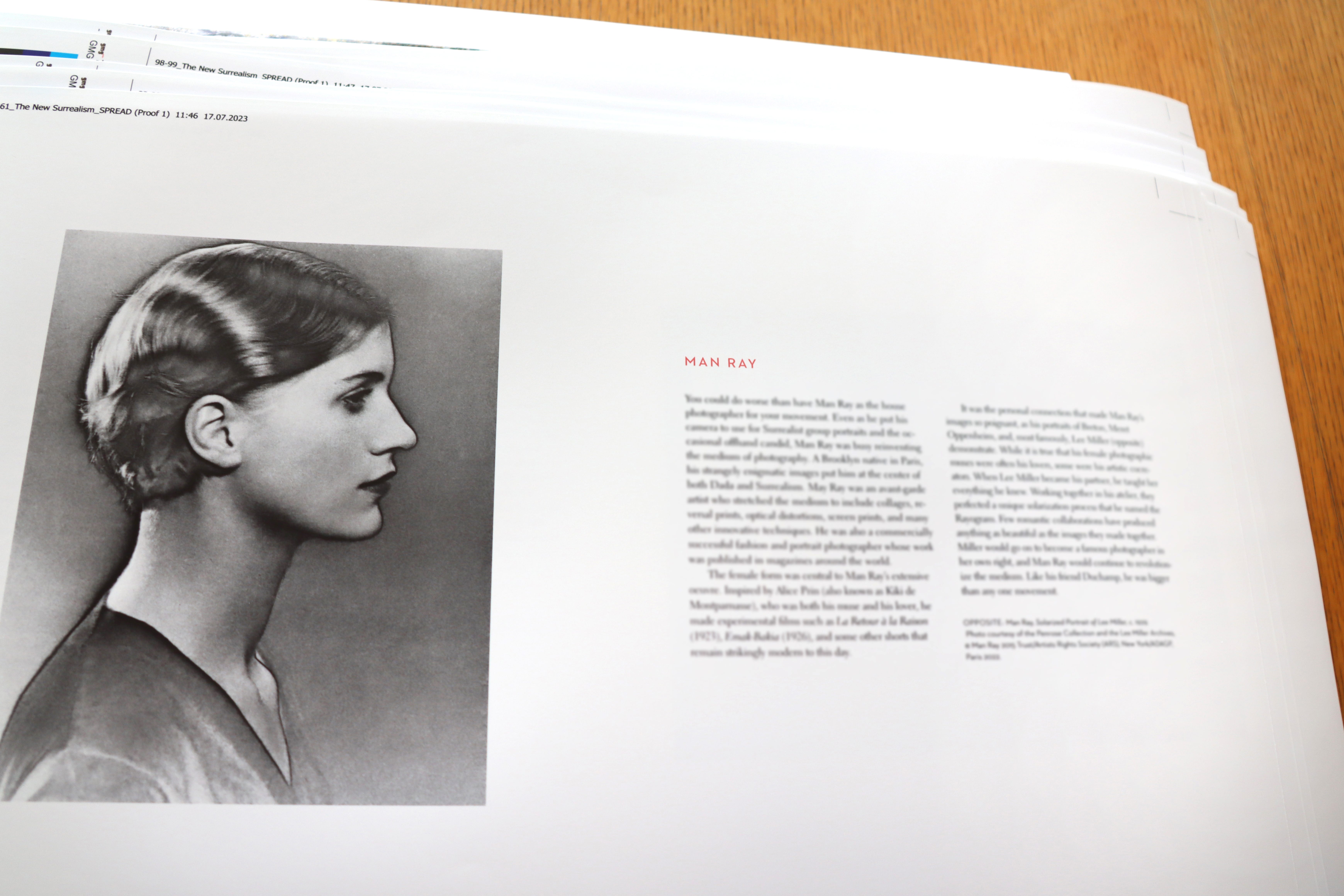
I was so happy that the Penrose Collection and Lee Miller Archives gave me clearance to use this image.
Going through the images one by one is a whole new way to “read” that book. Not that I ever, ever, need to read this book again in my lifetime.
But it is going to be tremendous book and make a huge impact. I can feel it.
And YES, I have deliberately blurred out the text on these shots.
No spoilers till later this fall.
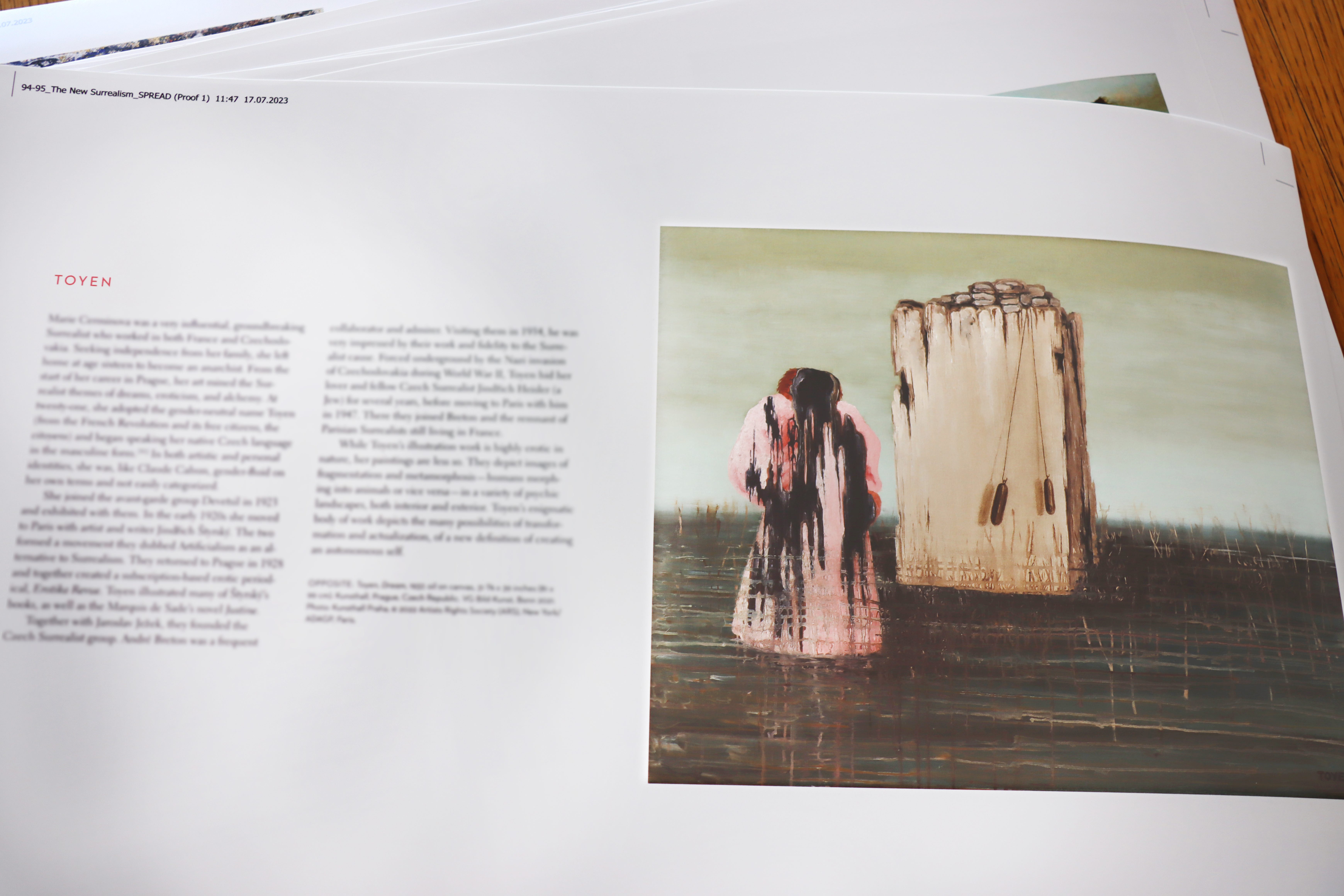
The female Surrealists are well represented in this book.
When I first started the process, glasses were off. But that did not last long.
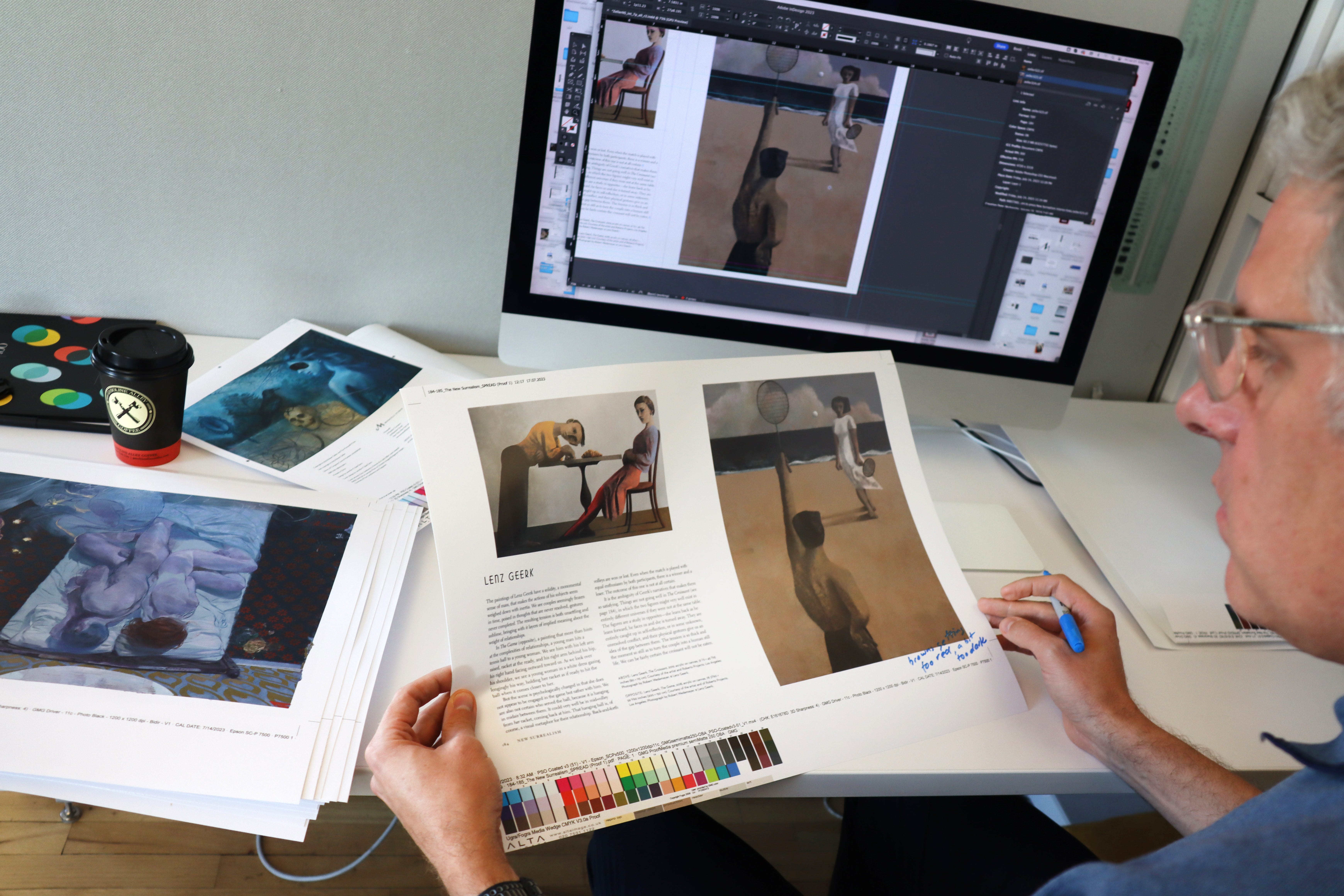
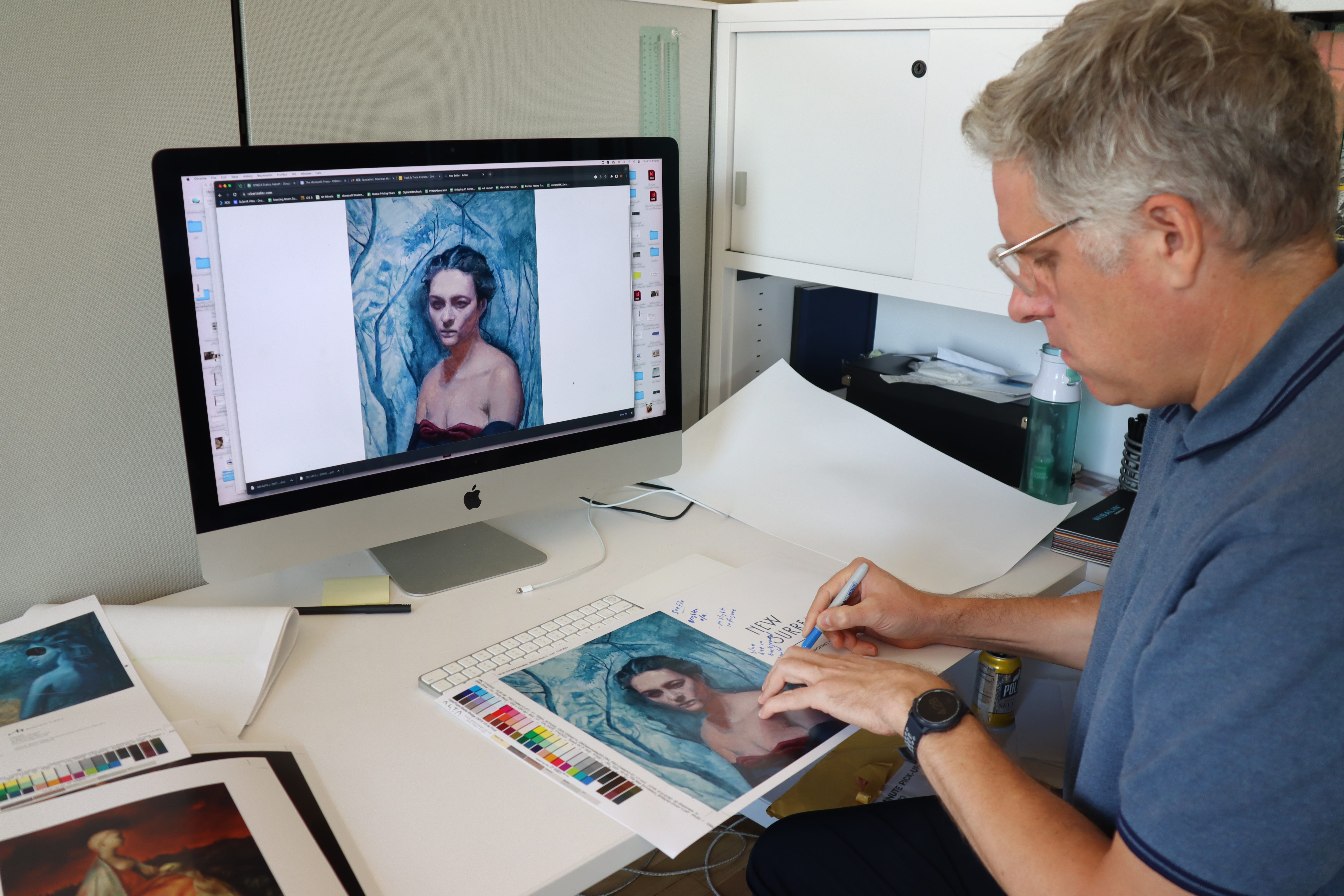
Here, Michael and I are color proofing the spread of the artist Lenz Geerk. Not all of the artists in the book self identify as Surrealists, but they all have elements of the surreal in their work.
Subscribe to this Substack to receive regular updates about my book.